Spatially-Aware Self-Organizing Maps(GeoSOM) Model
Source:vignettes/Spatially-Aware-Self-Organizing-Maps.Rmd
Spatially-Aware-Self-Organizing-Maps.RmdThis vignette explains how to run a GeoSOM model in
geosom package.
Load data and package
Here use pmc data,more details see
help(pmc).
library(geosom)

data(pmc)
head(pmc)
## # A tibble: 6 × 14
##   centroidx centroidy denspop11 discapd gmm2011  podc tdesmp11 pbsst11 ne_sup
##       <dbl>     <dbl>     <dbl>   <dbl>   <dbl> <dbl>    <dbl>   <dbl>  <dbl>
## 1    -2126.   -26872.      55.0  49814.    970.  86.8     13.6   0.743  10.3
## 2   -22225.   101936      142.   23220.    920.  85.2     10.1   0.329   9.73
## 3    51047.   123750       26.5  32855.    692.  61.6      8.9   0.749   4.65
## 4    65335.  -116583       10.8  46776.    765.  57.1     15.6   1.11    4.98
## 5   -30628.   114637      159.   15458.    910.  80.2     10.4   0.301   9.52
## 6    -8846.  -281339      290.   30102.    914. 103.      17.2   0.992  11.5
## # ℹ 5 more variables: abanesc <dbl>, pdmcdt11 <dbl>, pdiv <dbl>,
## #   distpolall <dbl>, tcrmiltot <dbl>
Determining the optimal paramater for GeoSOM
set.seed(20220724)
tictoc::tic()
geosom_bestparam(data = pmc,
                 coords = c("centroidx","centroidy"),
                 wt = c(seq(0.1,1,by = 0.1),2:5),
                 xdim = 4:10, ydim = 4:10,cores = 6) -> g_bestparam
tictoc::toc()
## 59.37 sec elapsed
g_bestparam
## $wt
## [1] 0.9
##
## $xdim
## [1] 4
##
## $ydim
## [1] 4
##
## $topo
## [1] "rectangular"
##
## $neighbourhoodfct
## [1] "gaussian"
##
## $err_quant
## [1] 9.439536
##
## $err_varratio
## [1] 21.05
##
## $err_topo
## [1] 0.5071942
##
## $err_kaski
## [1] 3.985932
Build GeoSOM model
g = geosom(data = pmc, coords = c("centroidx","centroidy"), wt = .9,
           grid = geosomgrid(4,4,topo = "rectangular",
                             neighbourhood.fct = "gaussian"))
Assessing the quality of the map
The geosom_quality() computes several measures to help
assess the quality of a GeoSOM.
geosom_quality(g)
##
## ## Quality measures:
##  * Quantization error     :  9.38318
##  * (% explained variance) :  21.52
##  * Topographic error      :  0.4856115
##  * Kaski-Lagus error      :  4.034355
##
## ## Number of obs. per map cell:
##  1  2  3  4  5  6  7  8  9 10 11 12 13 14 15 16
##  8 15 16 27 15  9  7 21 32 13 10 20 31 22 18 14
Quantization error: Average squared distance between the data points and the map’s prototypes to which they are mapped. Lower is better.
Percentage of explained variance: Similar to other clustering methods, the share of total variance that is explained by the clustering (equal to 1 minus the ratio of quantization error to total variance). Higher is better.
Topographic error: Measures how well the topographic structure of the data is preserved on the map. It is computed as the share of observations for which the best-matching node is not a neighbor of the second-best matching node on the map. Lower is better: 0 indicates excellent topographic representation (all best and second-best matching nodes are neighbors), 1 is the maximum error (best and second-best nodes are never neighbors).
Kaski-Lagus error: Combines aspects of the quantization and topographic error. It is the sum of the mean distance between points and their best-matching prototypes, and of the mean geodesic distance (pairwise prototype distances following the SOM grid) between the points and their second-best matching prototype.
Superclasses of GeoSOM
It is common to further cluster the GeoSOM map into superclasses, groups of cells with similar profiles. This is done using classic clustering algorithms on the map’s prototypes.
Two methods are implemented in spEcula now, PAM
(k-medians) and hierarchical clustering. This is how to obtain them in
R. In this example, we choose 12 superclasses. We will return to the
choice of superclasses below.
g_superclass = geosom_superclass(g,12,method = 'pam')
g_superclass
##  [1]  1  2  3  4  1  1  5  6  1  7  8  9 10 11 12  9
Plotting general map information
geosom_plot() creates a variety of different interactive
SOM visualizations. Using the type argument to the
function, one the following types of plots can be created:
- Observations Cloud: visualize the observations as points inside their cell.
geosom_plot(g, type = "Cloud", superclass = g_superclass)-
Hitmap or population map:
visualizes the number of observation per cell. The areas of the inner
shapes are proportional to their population.
The background colors indicate the superclasses. The palette of these colors can be adapted using thepalscargument.
geosom_plot(g, type = "Hitmap", superclass = g_superclass)- UMatrix is a way to explore the topography of the map. It shows the average distance between each cell and its neighbors’ prototypes, on a color scale. On this map, the darker cells are close to their neighbors, while the brighter cells are more distant from their neighbors.
geosom_plot(g, type = "UMatrix", superclass = g_superclass)Plotting numeric variables on the map
geosom_plot() offers several types of plots for numeric
variables :
- circular barplot
- barplot
- boxplot
- radar plot
- lines plot
- color plot (heat map)
In all of these plots, by default the means of the chosen variables
are displayed within each cell. Other choices of values (medians or
prototypes) can be specified using the values parameter.
The scales of the plots can also be adapted, using the
scales argument. Colors of the variables are controlled by
the palvar argument.
geosom_plot(g, type = "Circular", superclass = g_superclass)On the following barplot, we plot the protoype values instead of the observations means.
geosom_plot(g, type = "Barplot", superclass = g_superclass, values = "prototypes") On the following box-and-whisker plot, the scales are set to be the same accross variables.
geosom_plot(g, type = "Boxplot", superclass = g_superclass, scales = "same") On the following lines plot, we use the observation medians instead of the means.
geosom_plot(g, type = "Line", superclass = g_superclass, values = "median") The following radar chart uses the default parameters.
geosom_plot(g, type = "Radar", superclass = g_superclass) The color plot, or heat map, applies to a single numeric variable.
The superclass overlay can be removed by setting the showSC
parameter to FALSE.
geosom_plot(g, type = "Color", superclass = g_superclass)
## Warning in aweSOM::aweSOMplot(som = gsom, type = type, data = gsom$data[[1]], :
## Color : Multiple variables provided, only the first one will be plotted.
You can save those plot use
htmlwidgets::saveWidget(),like:
htmlwidgets::saveWidget(geosom_plot(g,type = "Circular",
                                    superclass = g_superclass),
                        './Circular.html')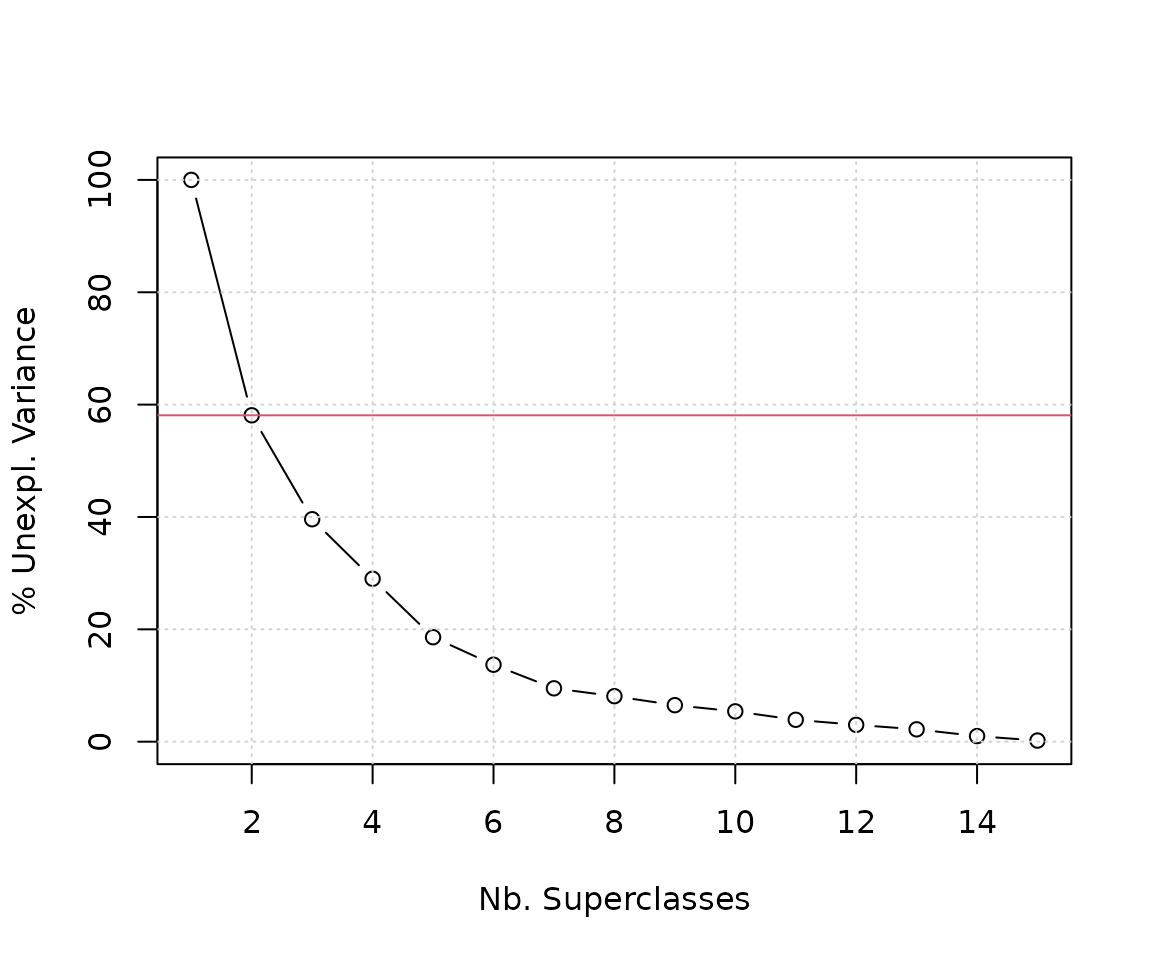
Get and viz the geosom cluster label
g_label = geosom_clusterlabel(g,g_superclass)
g_label
##   [1]  9  7  1  3  7  4  6  9  9  6  4  9  1  1  4  4  6  1  9  4  9  2  8  3  6
##  [26] 11 10 12  8 10  1  1 11  3  2  9 12  5  9 11 10  3  6  9  4  1  6  9  3 10
##  [51] 10  1 10  9  9 10  2 12  1  1  9  6  8  1 11  2  7  4  4  1 10  5  1 11 12
##  [76] 12  9  5  1  2  3  2  9 11 10  7  3  3 10  4 10  4  8 12  1  8  1  1  2  1
## [101]  2  1  9 11  1  6  1 10  1 12  4  4  1  9  6  4  6  9 12 11  2  1  9 11  1
## [126]  1 11  9  2 11 12  1 10  4  1 12 12  1  1  1  1  6 10  4  1  2 10  5 12  6
## [151]  5 12  3  3  1  7  9  1  2  9  4  6  6  1  4 11  7 12  1  9  4 11 11  6  1
## [176] 11 10  8 12 11  1  1  1  8  9  1  1  8 10 10  5  2  3  4 11  9 10 10  2  3
## [201]  3 11  1  9  1  1  9  1 11  1  9  4 10  4 11  1  7  9  1  1  6  1  4  8  6
## [226]  6  7  4  4  6  9 12  5  1  1  1  4 10  9  7  1  9  9  1 10 12  7 10 11  1
## [251]  6  3 10  3 10  8  4 10  1  6  9 10 10  1 11  7 12  1  1  4  2 10  3  1  1
## [276]  7 10  7
library(ggplot2)
library(dplyr)
##
## Attaching package: 'dplyr'
## The following objects are masked from 'package:stats':
##
##     filter, lag
## The following objects are masked from 'package:base':
##
##     intersect, setdiff, setequal, union
pmc %>%
  mutate(zone = as.factor(g_label)) %>%
  st_as_sf(coords = c("centroidx","centroidy")) %>%
  ggplot() +
  geom_sf(aes(col = zone),size = 1.25,shape = 17) +
  scale_color_discrete(type = 'viridis') +
  theme_bw() +
  theme(axis.text = element_blank(),
        axis.ticks = element_blank())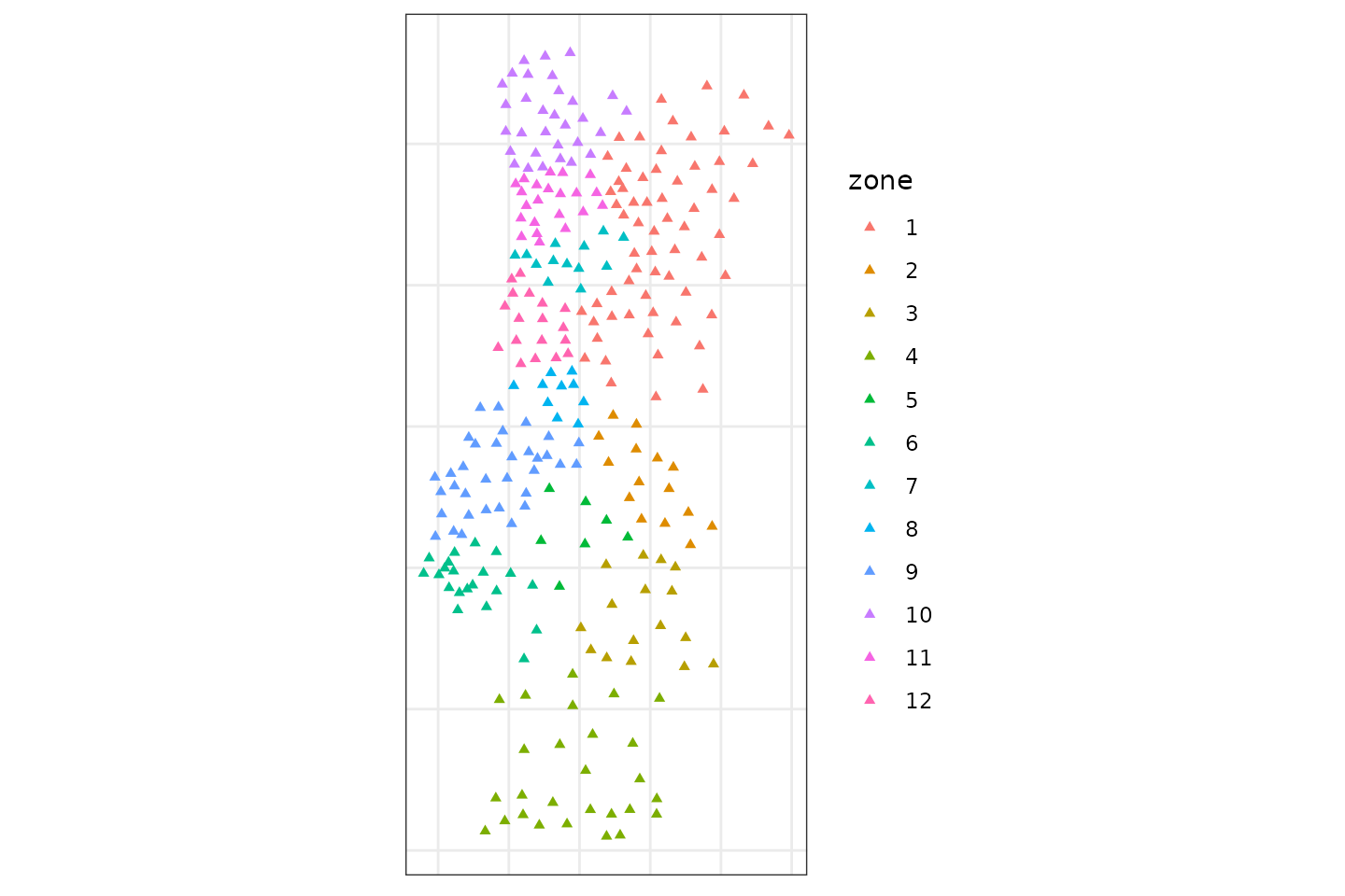
You can also use mapview to interactive view.